Post written by Lindsay Richman:
Earlier this month, I headed to Boston for a reprise of Dash, a framework for creating webapps in pure Python. I’m a huge fan of their interactive graphing library, Plotly, which I’ve been using intensively at work. The Plotly team has been working hard to extend their product by incorporating user feedback, and there’s a few key updates and takeaways that I think will excite data visualization specialists, and pave the way toward wider adoption:
- Crossfiltering is now available!
Crossfiltering techniques allow users to isolate specific parts of data across multiple visualizations in order to better look for patterns. The following example, which displays infant mortality rates across a 25 year period, provides an intuitive, and frankly beautiful, way of filtering different datasets.
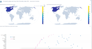
Both the lasso and box select tools can easily be used to drag and select specific segments of a single chart, which creates a similar filter for all charts in the app. Apps and dashboards with crossfiltering can be created in Chart Studio, or designed in Python and deployed with services like Heroku. - Plotly components remain a core part of Dash apps!
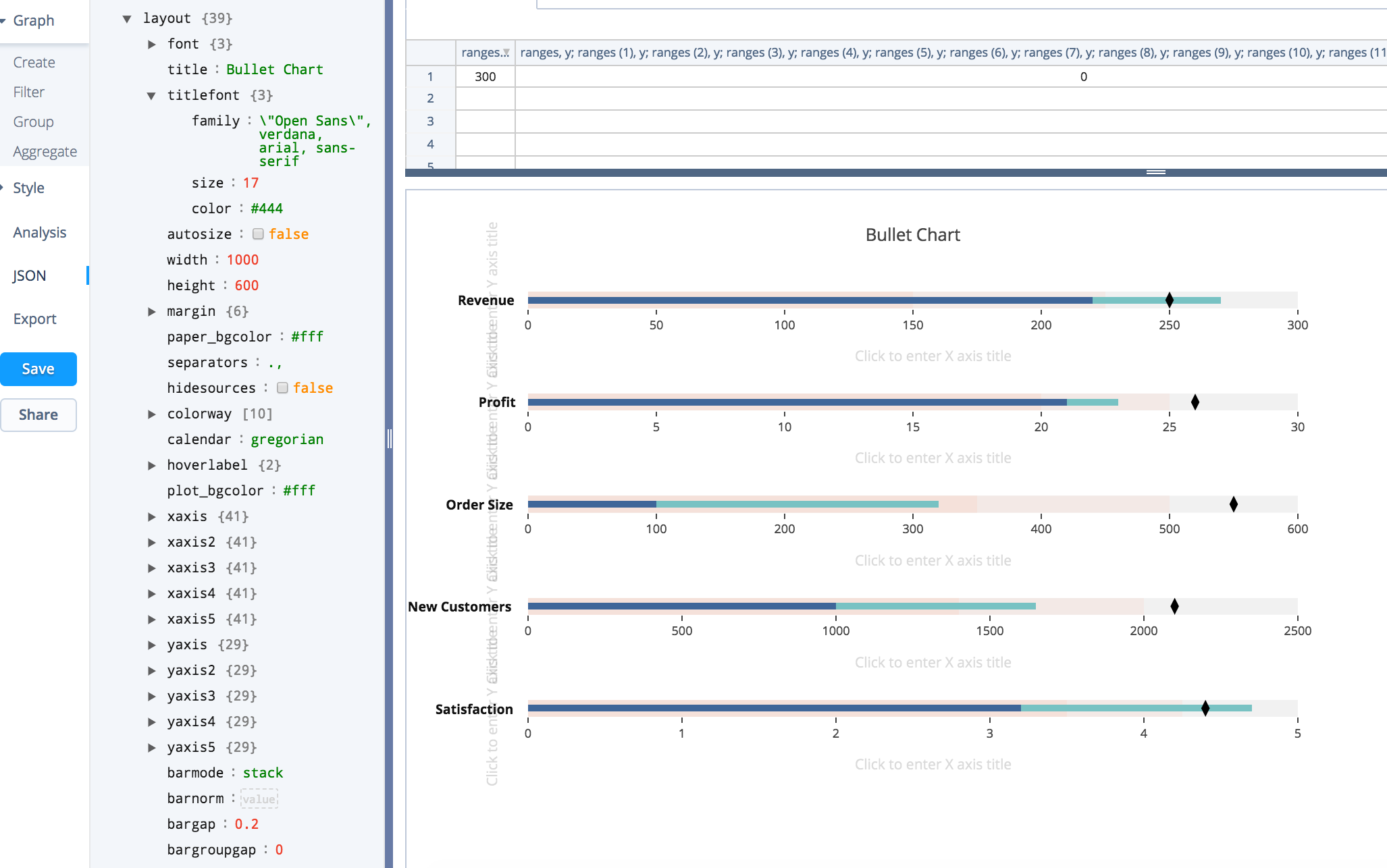
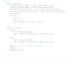
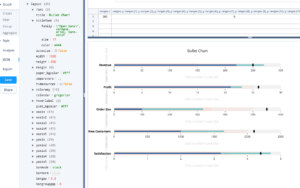
With more Plotly charting experience under my belt, I was really able to see the link between Plotly charts and a Dash app. Plotly charts can easily become components of Dash apps, and their abilities can be extended with techniques such as crossfiltering. One thing you learn from the workshops, and from experience, is that Plotly charts are comprised of two main objects: data and layout. You can see an example here in the code from a Dash app:
The full code can be viewed here, where you can see how crossfiltering and Plotly charts are combined to create a dynamic app in Dash. - Chart Studio will be open-sourced, and integrated into Jupyter Notebook!
This is a hugely exciting update, as Jupyter Notebook is an incredibly useful application that supports people from a wide variety of programming backgrounds. Chart Studio integration will allow Plotly developers to toggle between code and a UI in the same client, and also support people who do not program. While I generally design interactive charts in code (usually in Python or Javascript), there are some properties I’d simply rather not create or modify in code due to individual preferences and time constraints. In addition, studying a visualization’s JSON, which can be viewed in Chart Studio and will be viewable in the Jupyter Notebook extension, can be an excellent way to learn about how a chart’s code is constructed.
To sum things up, I’m super excited about Plotly and Dash’s capabilities, and roadmap, over the next 6-12 months. The framework is already being utilized by at least one team at New Ventures, and will likely continue to gain traction at McKinsey, at other companies, and within the open-source community.