Post written by Lindsay Richman:
I was thrilled to attend the Dash Masterclass workshop at PlotCon on November 18th-19th, with the support of WiMLDS. Dash, created by the founders of Plotly, is a framework that allows one to create beautiful, interactive data visualizations in pure Python. It greatly reduces the amount of code needed for build, and eliminates the need to use Javascript. Dash is built on top of Flask, Plotly.js, and React; components are built in React, so knowledge of Javascript, though not required, is still useful!
The masterclass was co-taught by Chris Parmer, the founder and co-creator of Dash. Since the workshop was split into two days, we spent the first working with Plotly components, and the second working with CSS and creating and deploying Dash apps. Here are some highlights from each day:
Day 1
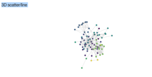
- We opened up Jupyter notebook, and got straight to work! We started by running code samples that introduced us to the different graph types, which included plots, bars, heatmaps, and even 3D styling. Here’s a sample image below, whose size and orientation can be manipulated by the user while in JSON format.
- We also dove into Python’s Pandas library in order to display dataframes that gave us the information we needed.
- If we needed to information about a certain chart type of component, the Python Plotly Library hosted a wealth of information. Note that users can also upload the graphs they program directly into Plotly accounts; here, they can explore the code, make changes, and copy and paste the modified code back into their IDE.
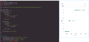
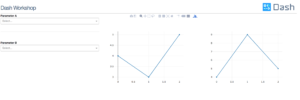
- By the end of the day, we focused on callbacks, which were definitely challenging. The instructors gave us some sample code, and showed us how it applied to Dash. We were then given some challenges, where we had to manipulate the code to customize the components. The example below shows the creation of a Dash chart with multiple inputs; the callback is fired when either input changes.
Day 2
- Day 2 built off of the work we’d done on callbacks, but then delved into the CSS stylesheets that had been created for Dash. The stylesheets contain styling “shortcuts” that can be referenced through the Dash property className.
- The CSS can be used to set the visual properties of the components, like chart background color, and label font and size. It can even be used to create an app styled with multiple columns.
- We then explored more advanced interactive charts, such as those that gave users the ability to hover over maps to find data-points.
- Finally, we deployed our apps. I have a Heroku account, and set-up and deployed my app from there. I did have to set up a virtual environment and compile quite a few files by hand, so the initial process wasn’t without effort. Once I had completed the steps, though, I felt confident that I could repeat them much more efficiently. You can my app by visiting this link, and find the documentation for how to deploy a Dash app here.
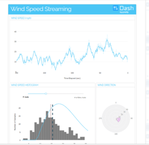
As you can probably see by these examples, Dash is a great framework for creating interactive data visualizations! If you’d like, you can get started by reading the documentation here. Happy plotting!


